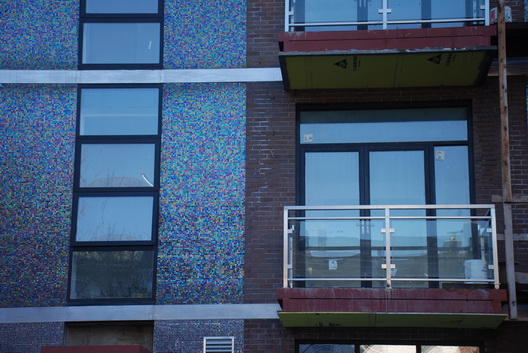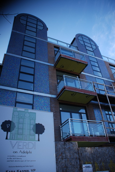
Photographer Nate Kensinger, whose work we love and whose forays into places that are hard to access have brought us great visual joy, sent us some photos of a condo in Fort Greene called the Verdi on Adelphi. It has been featured many times by our friends at Brownstoner, who have not minced words about its aesthetics. Phrases like “a mix of generic-looking brick and an over-the-top swaths of blue mosaic tile” and “an over-the-top eyesore” have been used. Mr. Kensinger wondered if it’s “the ugliest building in Brooklyn” in sending us photos. The “Ugliest in Brooklyn” competition is beyond our scope here and would have dozens of nasty contestants, so we’ll just share a bit of his love for the Verdi:
This is the Verdi on Adelphi St, near the Navy Yard… they have been working on it for a while… but you really have to get up close to see how horrendous the tiles on this thing are! Its would be like living inside of a disco ball, or a fragmented oil slick. Its being touted as “a modern compliment to the rich history and lush streetscapes of fort greene.” Haha. How does a mirrored tile jukebox complement a classic brownstone?
Mr. Kensinger also checked out the website of the architect Gene Kaufman, whose latest work will include a hotel and two residential buildings on N. 12 Street in Williamsburg, and writes:
He is working on some truly awful buildings, and has great descriptions of the neighborhoods he is trying so hard to gentrify. He calls Bushwick a “recently troubled neighborhood” and is helping a client in “re-homesteading a deteriorated area” on 11th and A in the East Village. He is also building on “a derelict contaminated site in the hip Williamsburg neighborhood” and is doing all sorts of waterfront glass boxes…
The tiles kind of remind of us the Gowanus Canal near the Union Street Bridge where oil bubbles to the surface and puts a nice sheen on the water.


2 responses so far ↓
1 Anonymous // Mar 8, 2008 at 6:34 pm
Those don’t look like exterior tiles..what a weird and ugly thing that is. So Italian 70s modern mixed with bad diner with atrium. Oh well.
Some poor homeless family from deteriorated 11th street may like to move here. Last time I looked, 11th and A was on a nice little park near the cristadora…things keep gettin’ shabbier and shabbier..
2 Anonymous // Mar 9, 2008 at 4:56 am
I lookd at Kaufman’s website…oh my.
Are those all autocad renderings? I saw no actual buildings really. Poor guy, but, obviously he has an audience.