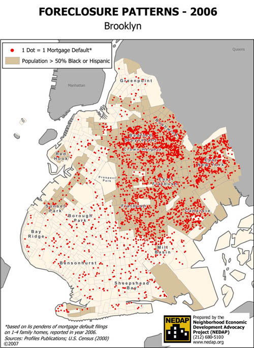
The map above is from a study of foreclosures in 2006 that was done by the Neighborhood Economic Development Advocacy Project. Those big concentrations of red dots are what you might call Subprime Mortgage Pox that is afflicting low-income Brooklyn communities as the so-called subprime market implodes. The Daily News had an entire bunch of the colorful maps yesterday (an we apologize for only getting to this today). The Brooklyn problem is concentrated in Bed-Stuy, Bushwick, Flatbush and East New York–in other words, in the communities in which schiesty lenders tend to operate. Which is not to say that cruddy mortgages haven’t been foisted on people in other communities or that people who might not have qualified for mortgages in a different market aren’t going to be victimized too. (We wonder who the half-dozen dots in Park Slope are and also noted that the Manhattan map showed one lonely dot below 96th Street.)
The report notes that in some neighborhoods up to 10 homes per block faced foreclosure last year. Overall about 9,000 homes went into foreclosure in ’06, 50 percent more than ’05. And, we’re afraid these numbers are going to seem like the good old days when all of these mortgages with artificially low front-end rates start claiming even more victims in the next one-four years.
